Android Material Design文本框设计指南
在本教程中,我们将使用新的材料设计组件库来实现文本字段。我们已经在这里实现了TextInputLayout。
材料设计文本字段
TextInputLayout提供了Material设计文本字段的实现。我们只需要使用TextInputEditText!首先,导入新的材料组件依赖项。同时,在您的Activity中设置MaterialComponent主题。
implementation 'com.google.android.material:material:1.1.0-alpha09'
默认情况下,输入文本框具有填充的背景以吸引用户的注意。现在让我们创建一个默认的文本框:
 <com.google.android.material.textfield.TextInputLayout
            android:layout_width="match_parent"
            android:layout_height="wrap_content"
            android:layout_marginBottom="12dp"
            android:hint="填充框(默认)">

            <com.google.android.material.textfield.TextInputEditText
                android:layout_width="match_parent"
                android:layout_height="wrap_content" />

</com.google.android.material.textfield.TextInputLayout>
在接下来的几个部分中,我们将以不同的方式自定义文本字段。
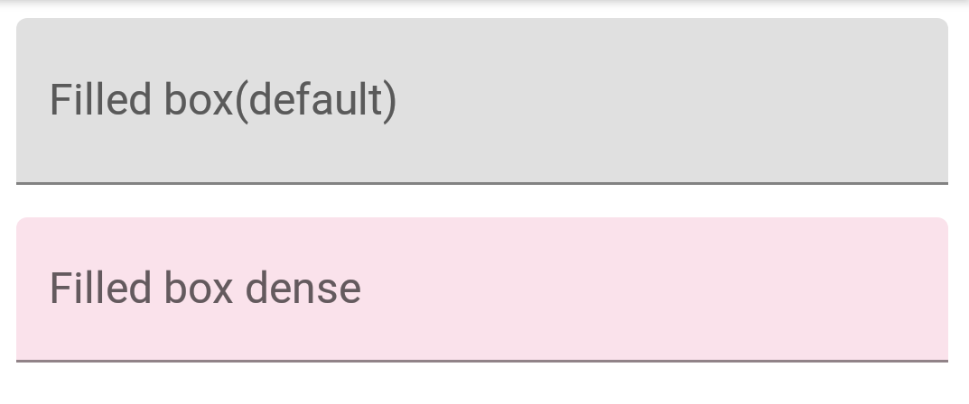
标准和密集的文本字段
文本字段有两种高度变体:
- 标准 – 如果没有特别设置,这是默认使用的样式。
- 密集 – @style/Widget.MaterialComponents.TextInputLayout.FilledBox.Dense
密集型文本字段的高度稍微矮一点。
<com.google.android.material.textfield.TextInputLayout
            android:layout_width="match_parent"
            android:layout_height="wrap_content"
            android:layout_marginBottom="12dp"
            android:hint="填充框(默认)">

            <com.google.android.material.textfield.TextInputEditText
                android:layout_width="match_parent"
                android:layout_height="wrap_content" />

        </com.google.android.material.textfield.TextInputLayout>

        <com.google.android.material.textfield.TextInputLayout
            style="@style/Widget.MaterialComponents.TextInputLayout.FilledBox.Dense"
            android:layout_width="match_parent"
            android:layout_height="wrap_content"
            android:layout_marginBottom="12dp"
            android:hint="密集填充框"
            app:boxBackgroundColor="#20D81B60">

            <com.google.android.material.textfield.TextInputEditText
                android:layout_width="match_parent"
                android:layout_height="wrap_content" />

        </com.google.android.material.textfield.TextInputLayout>
默认情况下,使用FilledBox.Standard样式,app:boxBackgroundColor用于设置填充框的颜色。以下是在屏幕上的显示效果:
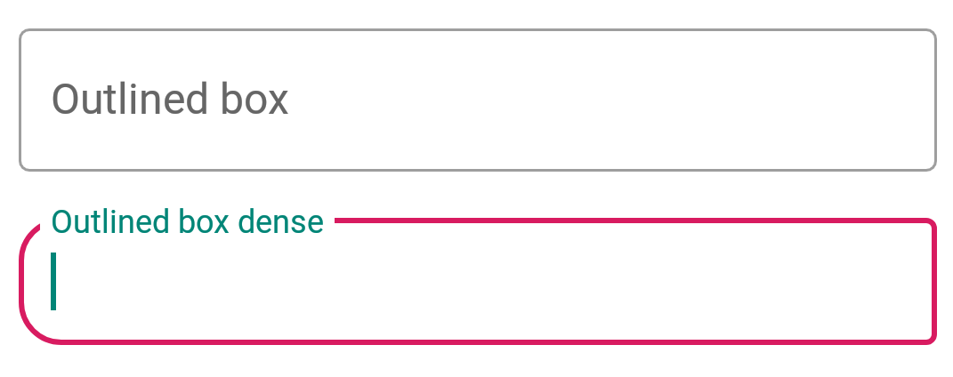
文本字段的外框样式
在TextInputLayout上应用以下样式以获得带有轮廓外观的文本字段:
style="@style/Widget.MaterialComponents.TextInputLayout.OutlinedBox"
类似于FilledBox,这个也有两种高度变体 – 标准和密集。为了设置角半径,使用以下属性:
- boxCornerRadiusTopStart – 左上角圆角半径
- boxCornerRadiusTopEnd – 右上角圆角半径
- boxCornerRadiusBottomStart – 左下角圆角半径
- boxCornerRadiusBottomEnd – 右下角圆角半径
boxStrokeColor 用于设置边框的描边颜色。这是它的效果:
末端图标模式
继续前进,现在让我们设置末端图标模式。这些基本上是设置在文本字段右侧的图标。目前,内建提供的三种类型的图标有:
- password_toggle – 密码切换图标
- clear_text – 清除文本图标
- custom – 自定义图标
以上属性是不言自明的。我们可以使用endIconTint属性为这些图标设置我们自己的图标色调。对于自定义图标,我们使用endIconDrawable属性。
<com.google.android.material.textfield.TextInputLayout
            style="@style/Widget.MaterialComponents.TextInputLayout.OutlinedBox.Dense"
            android:layout_width="match_parent"
            android:layout_height="wrap_content"
            android:layout_marginBottom="12dp"
            android:hint="输入密码"
            app:endIconMode="password_toggle">

            <com.google.android.material.textfield.TextInputEditText
                android:layout_width="match_parent"
                android:layout_height="wrap_content" />

        </com.google.android.material.textfield.TextInputLayout>

        <com.google.android.material.textfield.TextInputLayout
            style="@style/Widget.MaterialComponents.TextInputLayout.OutlinedBox.Dense"
            android:layout_width="match_parent"
            android:layout_height="wrap_content"
            android:layout_marginBottom="12dp"
            android:hint="输入密码"
            app:endIconMode="password_toggle"
            app:endIconTint="@color/colorAccent">

            <com.google.android.material.textfield.TextInputEditText
                android:layout_width="match_parent"
                android:layout_height="wrap_content" />

        </com.google.android.material.textfield.TextInputLayout>

        <com.google.android.material.textfield.TextInputLayout
            style="@style/Widget.MaterialComponents.TextInputLayout.OutlinedBox.Dense"
            android:layout_width="match_parent"
            android:layout_height="wrap_content"
            android:layout_marginBottom="12dp"
            android:hint="清除文本"
            app:endIconMode="clear_text"
            app:endIconTint="@color/colorPrimaryDark">

            <com.google.android.material.textfield.TextInputEditText
                android:layout_width="match_parent"
                android:layout_height="wrap_content" />

        </com.google.android.material.textfield.TextInputLayout>


        <com.google.android.material.textfield.TextInputLayout
            style="@style/Widget.MaterialComponents.TextInputLayout.OutlinedBox.Dense"
            android:layout_width="match_parent"
            android:layout_height="wrap_content"
            android:layout_marginBottom="12dp"
            android:hint="自定义末端图标"
            app:endIconCheckable="true"
            android:id="@+id/custom_end_icon"
            app:endIconDrawable="@android:drawable/ic_input_add"
            app:endIconMode="custom"
            app:endIconTint="@color/colorPrimaryDark">

            <com.google.android.material.textfield.TextInputEditText
                android:layout_width="match_parent"
                android:layout_height="wrap_content" />

        </com.google.android.material.textfield.TextInputLayout>
以下是屏幕上的显示效果:
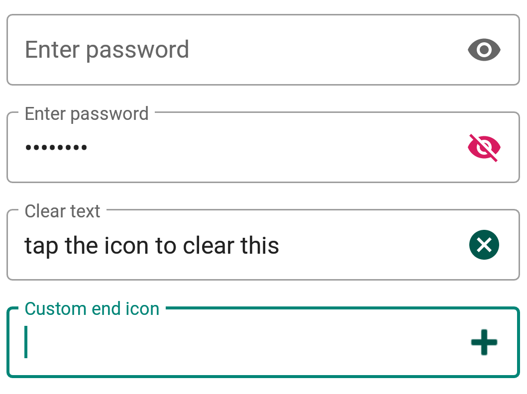
对于自定义图标,我们可以使用setEndIconOnClickListener回调来监听点击事件并执行相应操作。
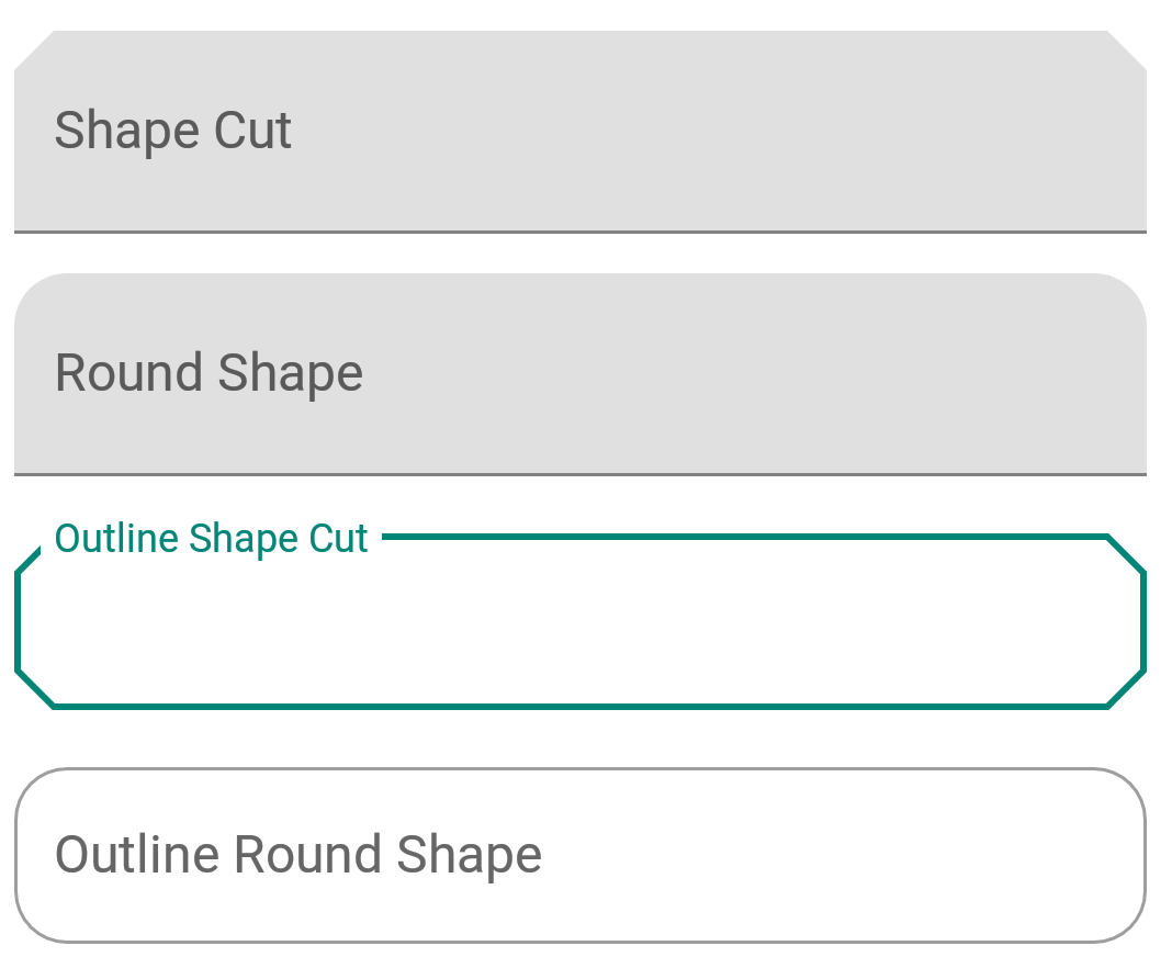
文本字段的形状
ShapeAppearance这一样式功能强大,它可以让我们自定义文本框的形状。我们有两种内置的形状-切割形和圆形。
<style name="Cut" parent="ShapeAppearance.MaterialComponents.MediumComponent">
        <item name="cornerFamily">cut</item>
        <item name="cornerSize">12dp</item>
    </style>

    <style name="Rounded" parent="ShapeAppearance.MaterialComponents.SmallComponent">
        <item name="cornerFamily">rounded</item>
        <item name="cornerSize">16dp</item>
    </style>
在shapeAppearance属性中设置上述样式会得到以下结果