Kotlinを使用したAndroidのアラートダイアログ。
このチュートリアルでは、Alert Dialogsについて説明し、Kotlinを使用してAndroidアプリケーションに実装します。
警告ダイアログ
アラートダイアログは画面上にポップアップするウィンドウです。通常、情報を表示し、ユーザーアクションを求めます。アラートダイアログを構成する主要なコンポーネントは3つあります。
- Title Text
- Message Text
- Buttons – There are three types of buttons: Positive, Negative, and Neutral
AlertDialogを作成するために、AlertDialog.Builder内部クラスを使用します。
val alertDialogBuilder = AlertDialog.Builder(this)
コンストラクター内にコンテキストを渡します。オプションで、アラートダイアログのスタイルを別のパラメーターとして渡すこともできます。
アラートダイアログのメソッド
「AlertDialog」で使用できるいくつかのメソッドです。
- setTitle
- setMessage
- setIcon
- setCustomTitle – Here you can pass a custom view that’ll be put in place of the title part in the alert dialog.
- setPositiveButton – We pass the string name, as well as Button, clicked callback method here.
- setView – used to add a custom view inside the alert dialog.
- setList – used to set an array of strings which would be displayed in the form of a List.
- setMultiChoiceList – again we can set an array but this time we can select multiple items from the List thanks to CheckBox.
- setPositiveButtonIcon – set an icon alongside the Button
- show() – used to display the AlertDialog
- setDismissListener – Inside this, you can set the logic to be triggered when the alert dialog is dismissed.
- setShowListener – set the logic to be triggered when the alert dialog is dismissed.
- setCancelable – requires a boolean value. By default all alert dialogs are cancelable on button click or touch outside. If this method is set to false, you need to explicitly cancel the dialog using dialog.cancel() method.
アラート ダイアログの Kotlin コードを教えてください。
AlertDialogをAndroid Studioのプロジェクトで使用するには、次のクラスをインポートしてください。
import android.support.v7.app.AlertDialog;
以下のKotlinコードは、シンプルなアラートダイアログを作成するために使用されます。
val builder = AlertDialog.Builder(this)
builder.setTitle("Androidly Alert")
builder.setMessage("We have a message")
//builder.setPositiveButton("OK", DialogInterface.OnClickListener(function = x))

builder.setPositiveButton(android.R.string.yes) { dialog, which ->
    Toast.makeText(applicationContext,
            android.R.string.yes, Toast.LENGTH_SHORT).show()
}

builder.setNegativeButton(android.R.string.no) { dialog, which ->
    Toast.makeText(applicationContext,
            android.R.string.no, Toast.LENGTH_SHORT).show()
}

builder.setNeutralButton("Maybe") { dialog, which ->
    Toast.makeText(applicationContext,
            "Maybe", Toast.LENGTH_SHORT).show()
}
builder.show()
builder.show()は、アラートダイアログを画面に表示します。setPositiveButton関数の内部では、ボタンのテキストとともに、そのボタンがクリックされたときにトリガーされるKotlin関数を渡します。この関数はDialogInterface.OnClickListener()インターフェースの一部です。関数のタイプは(DialogInterface, Int) -> Unitです。DialogInterfaceはダイアログのインスタンスであり、IntはクリックされたボタンのIDです。上記のコードでは、この関数をハイオーダーなKotlin関数として表現しています。dialogとwhichは二つの引数を表します。引数が使用されない場合には、_を渡すことで関数を改善することができます。次のような関数になります。
builder.setPositiveButton(android.R.string.yes) { _,_ ->
            Toast.makeText(applicationContext,
                    android.R.string.yes, Toast.LENGTH_SHORT).show()
        }
選択肢としては、AlertDialogクラスのインスタンスを使ってDialogを表示することもできます。builder.show()を以下のように置き換えます。
val alertDialog = builder.create()
alertDialog.show()
ボタンのクリックリスナー関数を各ボタンごとに定義する代わりに、高階関数として別々に定義することもできます。
val positiveButtonClick = { dialog: DialogInterface, which: Int ->
    Toast.makeText(applicationContext,
            android.R.string.no, Toast.LENGTH_SHORT).show()
}
次に、このvalプロパティをsetPositiveButton Kotlin関数内に設定してください。
builder.setPositiveButton("OK", DialogInterface.OnClickListener(function = positiveButtonClick))
//or
builder.setPositiveButton(android.R.string.yes, positiveButtonClick)
ボタンのクリック時に何の処理も行わない場合は、代わりにnullを関数に渡すことができます。
Kotlinはまだ上記のコードの可読性を向上させるためにより多くの力を持っています。
シンプルなアラートダイアログのKotlinコード
with関数を使用することで、Kotlinのコードでアラートダイアログを作成する際の可読性を向上させることができます。
fun basicAlert(view: View){

        val builder = AlertDialog.Builder(this)

        with(builder)
        {
            setTitle("Androidly Alert")
            setMessage("We have a message")
            setPositiveButton("OK", DialogInterface.OnClickListener(function = positiveButtonClick))
            setNegativeButton(android.R.string.no, negativeButtonClick)
            setNeutralButton("Maybe", neutralButtonClick)
            show()
        }


    }
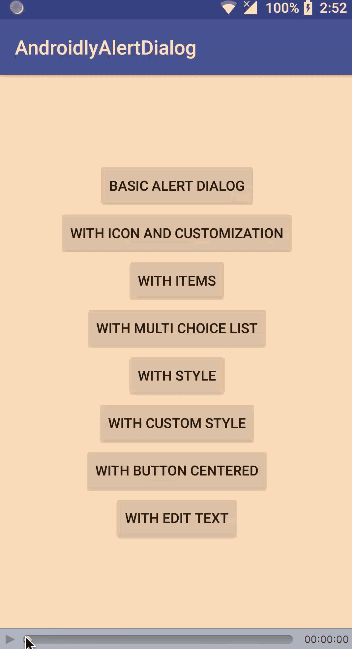
次のセクションでは、AlertDialogに以下の機能を実装するAndroidアプリケーションを作成します。
- Simple Alert Dialog
- Alert Dialog With Icon and Button Customisation
- Alert Dialog With List
- Alert Dialog With MultiChoice List
- Alert Dialog With Style
- Alert Dialog With Custom Style
- Alert Dialog With EditText
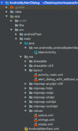
アンドロイドスタジオのプロジェクト構造
1. XMLレイアウトコードをパラフレーズする
下記にactivity_main.xmlレイアウトのコードが提供されています。
<?xml version="1.0" encoding="utf-8"?>
<LinearLayout xmlns:android="http://schemas.android.com/apk/res/android"
    xmlns:tools="http://schemas.android.com/tools"
    android:layout_width="match_parent"
    android:layout_height="match_parent"
    android:gravity="center"
    android:orientation="vertical"
    tools:context=".MainActivity">

    <Button
        android:id="@+id/btnBasicAlert"
        android:layout_width="wrap_content"
        android:onClick="basicAlert"
        android:layout_height="wrap_content"
        android:text="BASIC ALERT DIALOG" />


    <Button
        android:id="@+id/btnAlertWithIconsAndCustomize"
        android:layout_width="wrap_content"
        android:onClick="withIconAndCustomise"
        android:layout_height="wrap_content"
        android:text="WITH ICON AND CUSTOMIZATION" />

    <Button
        android:id="@+id/btnAlertWithItems"
        android:layout_width="wrap_content"
        android:layout_height="wrap_content"
        android:onClick="withItems"
        android:text="WITH ITEMS" />

    <Button
        android:id="@+id/btnAlertWithMultiChoiceList"
        android:layout_width="wrap_content"
        android:layout_height="wrap_content"
        android:onClick="withMultiChoiceList"
        android:text="WITH MULTI CHOICE LIST" />

    <Button
        android:id="@+id/btnAlertWithStyle"
        android:layout_width="wrap_content"
        android:layout_height="wrap_content"
        android:onClick="withStyle"
        android:text="WITH STYLE" />


    <Button
        android:id="@+id/btnAlertWithCustomStyle"
        android:layout_width="wrap_content"
        android:layout_height="wrap_content"
        android:onClick="withCustomStyle"
        android:text="WITH CUSTOM STYLE" />

    <Button
        android:id="@+id/btnAlertWithButtonCentered"
        android:layout_width="wrap_content"
        android:layout_height="wrap_content"
        android:onClick="withButtonCentered"
        android:text="WITH BUTTON CENTERED" />

    <Button
        android:id="@+id/btnAlertWithEditText"
        android:layout_width="wrap_content"
        android:layout_height="wrap_content"
        android:onClick="withEditText"
        android:text="WITH EDIT TEXT" />


</LinearLayout>
ボタンごとに、関数名を指定したandroid:onClick属性を設定しました。これらのKotlin関数はMainActivity.ktクラスでトリガーされます。それぞれの関数について順に説明します。
2. コトリンのメインアクティビティコード
上記の最初のアラートダイアログはすでに作成しました。それを使って、MainActivity.ktの外観を見てみましょう。
package net.androidly.androidlyalertdialog
import android.content.DialogInterface
import android.support.v7.app.AppCompatActivity
import android.os.Bundle
import android.support.v7.app.AlertDialog
import android.view.View
import android.widget.Toast
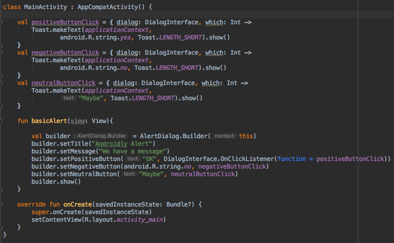
class MainActivity : AppCompatActivity() {
val positiveButtonClick = { dialog: DialogInterface, which: Int ->
Toast.makeText(applicationContext,
android.R.string.yes, Toast.LENGTH_SHORT).show()
}
val negativeButtonClick = { dialog: DialogInterface, which: Int ->
Toast.makeText(applicationContext,
android.R.string.no, Toast.LENGTH_SHORT).show()
}
val neutralButtonClick = { dialog: DialogInterface, which: Int ->
Toast.makeText(applicationContext,
"Maybe", Toast.LENGTH_SHORT).show()
}
override fun onCreate(savedInstanceState: Bundle?) {
super.onCreate(savedInstanceState)
setContentView(R.layout.activity_main)
}
fun basicAlert(view: View){
val builder = AlertDialog.Builder(this)
with(builder)
{
setTitle("Androidly Alert")
setMessage("We have a message")
setPositiveButton("OK", DialogInterface.OnClickListener(function = positiveButtonClick))
setNegativeButton(android.R.string.no, negativeButtonClick)
setNeutralButton("Maybe", neutralButtonClick)
show()
}
}
}
3. アイコンとカスタマイズが可能なアラートダイアログ
val builder = AlertDialog.Builder(this)
        with(builder) {
            setTitle("Icon and Button Color")
            setMessage("We have a message")
            setPositiveButton("OK", null)
            setNegativeButton("CANCEL", null)
            setNeutralButton("NEUTRAL", null)
            setPositiveButtonIcon(resources.getDrawable(android.R.drawable.ic_menu_call, theme))
            setIcon(resources.getDrawable(android.R.drawable.ic_dialog_alert, theme))
        }
        val alertDialog = builder.create()
        alertDialog.show()

        val button = alertDialog.getButton(DialogInterface.BUTTON_POSITIVE)
        with(button) {
            setBackgroundColor(Color.BLACK)
            setPadding(0, 0, 20, 0)
            setTextColor(Color.WHITE)
        }
getButtonを使用すると、それぞれの定数を設定して、任意のボタンを取得することができます。ボタンを取得した後は、上記の方法でカスタマイズすることができます。
4. 項目付きのアラートダイアログ
fun withItems(view: View) {

        val items = arrayOf("Red", "Orange", "Yellow", "Blue")
        val builder = AlertDialog.Builder(this)
        with(builder)
        {
            setTitle("List of Items")
            setItems(items) { dialog, which ->
                Toast.makeText(applicationContext, items[which] + " is clicked", Toast.LENGTH_SHORT).show()
            }

            setPositiveButton("OK", positiveButtonClick)
            show()
        }
    }
setItems内で、私たちはKotlinの配列を渡します。which引数は、リスト内でクリックされた要素のインデックスを表します。
5. マルチチョイスリストを持つアラートダイアログ
fun withMultiChoiceList(view: View) {

        val items = arrayOf("Microsoft", "Apple", "Amazon", "Google")
        val selectedList = ArrayList<Int>()
        val builder = AlertDialog.Builder(this)

        builder.setTitle("This is list choice dialog box")
        builder.setMultiChoiceItems(items, null
        ) { dialog, which, isChecked ->
            if (isChecked) {
                selectedList.add(which)
            } else if (selectedList.contains(which)) {
                selectedList.remove(Integer.valueOf(which))
            }
        }

        builder.setPositiveButton("DONE") { dialogInterface, i ->
            val selectedStrings = ArrayList<string>()

            for (j in selectedList.indices) {
                selectedStrings.add(items[selectedList[j]])
            }

            Toast.makeText(applicationContext, "Items selected are: " + Arrays.toString(selectedStrings.toTypedArray()), Toast.LENGTH_SHORT).show()
        }

        builder.show()

    }
上記のコードでは、選択肢を整数の配列リストに保存し、再び取得してToastメッセージに表示します。
6. スタイルを持つアラートダイアログ
fun withStyle(view: View) {

        val builder = AlertDialog.Builder(ContextThemeWrapper(this, android.R.style.Holo_SegmentedButton))

        with(builder)
        {
            setTitle("Androidly Alert")
            setMessage("We have a message")
            setPositiveButton("OK", DialogInterface.OnClickListener(function = positiveButtonClick))
            setNegativeButton(android.R.string.no, negativeButtonClick)
            setNeutralButton("Maybe", neutralButtonClick)
            show()
        }
    }
ContextThemeWrapperを使用しない場合、Alert Dialogはフルスクリーンで表示されます。
7. カスタムスタイルのアラートダイアログ
styles.xml ファイルに次のコードを追加してください。
<style name="AlertDialogCustom" parent="@android:style/Theme.Material.Dialog">
        <item name="android:textColor">@android:color/white</item>
        <item name="android:textStyle">bold</item>
        <item name="android:headerDividersEnabled">true</item>
        <item name="android:background">@android:color/holo_blue_dark</item>
    </style>
以下はKotlinの関数です。 (I’ll provide one option)
fun withCustomStyle(view: View) {

        val builder = AlertDialog.Builder(ContextThemeWrapper(this, R.style.AlertDialogCustom))

        with(builder)
        {
            setTitle("Androidly Alert")
            setMessage("We have a message")
            setPositiveButton("OK", DialogInterface.OnClickListener(function = positiveButtonClick))
            setNegativeButton(android.R.string.no, negativeButtonClick)
            setNeutralButton("Maybe", neutralButtonClick)
            show()
        }

    }
8. ボタンが中央に配置されたアラートダイアログ
fun withButtonCentered(view: View) {

        val alertDialog = AlertDialog.Builder(this).create()
        alertDialog.setTitle("Title")
        alertDialog.setMessage("Message")

        alertDialog.setButton(AlertDialog.BUTTON_POSITIVE, "Yes"
        ) { dialog, which -> dialog.dismiss() }

        alertDialog.setButton(AlertDialog.BUTTON_NEGATIVE, "No"
        ) { dialog, which -> dialog.dismiss() }
        alertDialog.show()

        val btnPositive = alertDialog.getButton(AlertDialog.BUTTON_POSITIVE)
        val btnNegative = alertDialog.getButton(AlertDialog.BUTTON_NEGATIVE)

        val layoutParams = btnPositive.layoutParams as LinearLayout.LayoutParams
        layoutParams.weight = 10f
        btnPositive.layoutParams = layoutParams
        btnNegative.layoutParams = layoutParams
    }
9. エディットテキストを含むアラートダイアログ (Edit Textを含むアラートダイアログ)
カスタムレイアウトalert_dialog_with_edittext.xmlのコードは以下の通りです:
<?xml version="1.0" encoding="utf-8"?>
<LinearLayout xmlns:android="http://schemas.android.com/apk/res/android"
    android:orientation="vertical"
    android:layout_width="match_parent"
    android:layout_height="match_parent">

    <EditText
        android:id="@+id/editText"
        android:layout_width="match_parent"
        android:layout_height="wrap_content"
        android:hint="Enter the text here"/>

</LinearLayout>
fun withEditText(view: View) {
        val builder = AlertDialog.Builder(this)
        val inflater = layoutInflater
        builder.setTitle("With EditText")
        val dialogLayout = inflater.inflate(R.layout.alert_dialog_with_edittext, null)
        val editText  = dialogLayout.findViewById<EditText>(R.id.editText)
        builder.setView(dialogLayout)
        builder.setPositiveButton("OK") { dialogInterface, i -> Toast.makeText(applicationContext, "EditText is " + editText.text.toString(), Toast.LENGTH_SHORT).show() }
        builder.show()
    }
Android Studioプロジェクトをダウンロードしてください:AndroidlyAlertDialog。