Android Materialのテキストフィールド
このチュートリアルでは、新しいMaterial Design Components Libraryを使用してテキストフィールドを実装します。すでにTextInputLayoutをここで実装しました。
材料のテキストフィールド
TextInputLayoutは、マテリアルデザインのテキストフィールドの実装を提供しています。私たちはTextInputEditTextを使うだけです!まず第一に、新しいマテリアルコンポーネントの依存関係をインポートします。そして、アクティビティでMaterialComponentのテーマを設定します。
implementation 'com.google.android.material:material:1.1.0-alpha09'
デフォルトでは、ユーザーの注意を引くために、入力テキストフィールドは背景が塗りつぶされています。では、デフォルトのテキストフィールドを作成しましょう。
 <com.google.android.material.textfield.TextInputLayout
            android:layout_width="match_parent"
            android:layout_height="wrap_content"
            android:layout_marginBottom="12dp"
            android:hint="Filled box(default)">

            <com.google.android.material.textfield.TextInputEditText
                android:layout_width="match_parent"
                android:layout_height="wrap_content" />

</com.google.android.material.textfield.TextInputLayout>
次のいくつかのセクションでは、さまざまな方法でテキストフィールドをカスタマイズします。
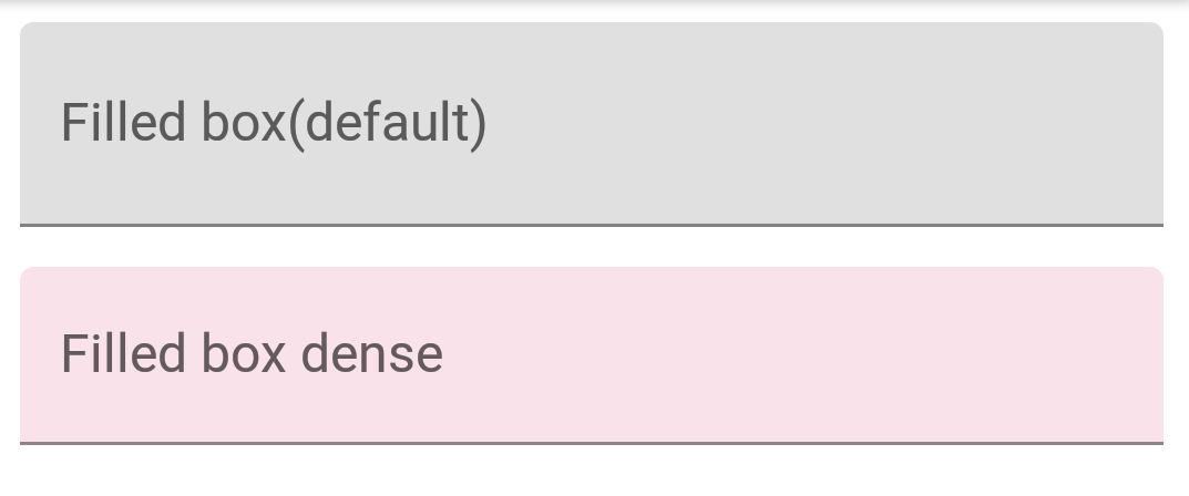
標準的なテキストフィールドと密集したテキストフィールド
テキストフィールドには、高さのバリエーションが2種類あります。
- Standard – This is used by default if nothing else is there.
- Dense – @style/Widget.MaterialComponents.TextInputLayout.FilledBox.Dense
密度の高いテキストフィールドは、わずかに高さが短くなっています。
<com.google.android.material.textfield.TextInputLayout
            android:layout_width="match_parent"
            android:layout_height="wrap_content"
            android:layout_marginBottom="12dp"
            android:hint="Filled box(default)">

            <com.google.android.material.textfield.TextInputEditText
                android:layout_width="match_parent"
                android:layout_height="wrap_content" />

        </com.google.android.material.textfield.TextInputLayout>

        <com.google.android.material.textfield.TextInputLayout
            style="@style/Widget.MaterialComponents.TextInputLayout.FilledBox.Dense"
            android:layout_width="match_parent"
            android:layout_height="wrap_content"
            android:layout_marginBottom="12dp"
            android:hint="Filled box dense"
            app:boxBackgroundColor="#20D81B60">

            <com.google.android.material.textfield.TextInputEditText
                android:layout_width="match_parent"
                android:layout_height="wrap_content" />

        </com.google.android.material.textfield.TextInputLayout>
デフォルトでは、FilledBox.Standardスタイルが使用されます。app:boxBackgroundColorを使用して、塗りつぶしボックスの色を設定します。画面上では、次のように表示されます。
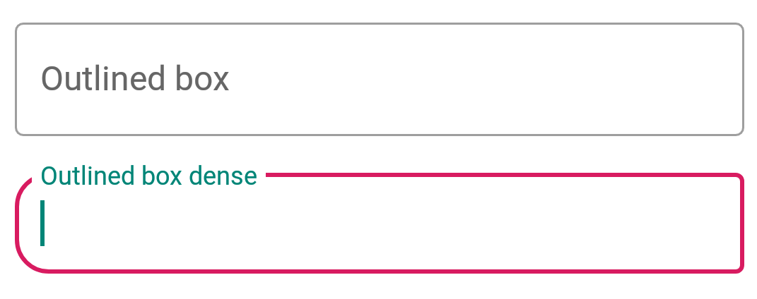
アウトラインボックステキストフィールド
以下のスタイルをTextInputLayoutに適用して、枠線付きのテキストフィールドの外観を得る。
style="@style/Widget.MaterialComponents.TextInputLayout.OutlinedBox"
フィルドボックスと同様に、このオプションにも通常版と密度版の2つの高さバリエーションがあります。コーナーの半径を設定するためには、以下の属性が使用されます。
- boxCornerRadiusTopStart
- boxCornerRadiusTopEnd
- boxCornerRadiusBottomStart
- boxCornerRadiusBottomEnd
boxStrokeColor は、アウトラインのストローク色を設定するために使用されます。こう見えます。
エンドアイコンモード
進んでいきましょう。さて、終了アイコンモードを設定しましょう。これらは基本的に、テキストフィールドの右側に配置されるアイコンです。現在、組み込まれているアイコンのタイプは3つあります。
- password_toggle
- clear_text
- custom
上記の属性は自己説明的です。endIconTint属性を使用してこれらのアイコンのアイコンティントを自分で設定することができます。カスタムアイコンには、endIconDrawable属性を使用します。
<com.google.android.material.textfield.TextInputLayout
            style="@style/Widget.MaterialComponents.TextInputLayout.OutlinedBox.Dense"
            android:layout_width="match_parent"
            android:layout_height="wrap_content"
            android:layout_marginBottom="12dp"
            android:hint="Enter password"
            app:endIconMode="password_toggle">

            <com.google.android.material.textfield.TextInputEditText
                android:layout_width="match_parent"
                android:layout_height="wrap_content" />

        </com.google.android.material.textfield.TextInputLayout>

        <com.google.android.material.textfield.TextInputLayout
            style="@style/Widget.MaterialComponents.TextInputLayout.OutlinedBox.Dense"
            android:layout_width="match_parent"
            android:layout_height="wrap_content"
            android:layout_marginBottom="12dp"
            android:hint="Enter password"
            app:endIconMode="password_toggle"
            app:endIconTint="@color/colorAccent">

            <com.google.android.material.textfield.TextInputEditText
                android:layout_width="match_parent"
                android:layout_height="wrap_content" />

        </com.google.android.material.textfield.TextInputLayout>

        <com.google.android.material.textfield.TextInputLayout
            style="@style/Widget.MaterialComponents.TextInputLayout.OutlinedBox.Dense"
            android:layout_width="match_parent"
            android:layout_height="wrap_content"
            android:layout_marginBottom="12dp"
            android:hint="Clear text"
            app:endIconMode="clear_text"
            app:endIconTint="@color/colorPrimaryDark">

            <com.google.android.material.textfield.TextInputEditText
                android:layout_width="match_parent"
                android:layout_height="wrap_content" />

        </com.google.android.material.textfield.TextInputLayout>


        <com.google.android.material.textfield.TextInputLayout
            style="@style/Widget.MaterialComponents.TextInputLayout.OutlinedBox.Dense"
            android:layout_width="match_parent"
            android:layout_height="wrap_content"
            android:layout_marginBottom="12dp"
            android:hint="Custom end icon"
            app:endIconCheckable="true"
            android:id="@+id/custom_end_icon"
            app:endIconDrawable="@android:drawable/ic_input_add"
            app:endIconMode="custom"
            app:endIconTint="@color/colorPrimaryDark">

            <com.google.android.material.textfield.TextInputEditText
                android:layout_width="match_parent"
                android:layout_height="wrap_content" />

        </com.google.android.material.textfield.TextInputLayout>
画面上ではこう表示されます。
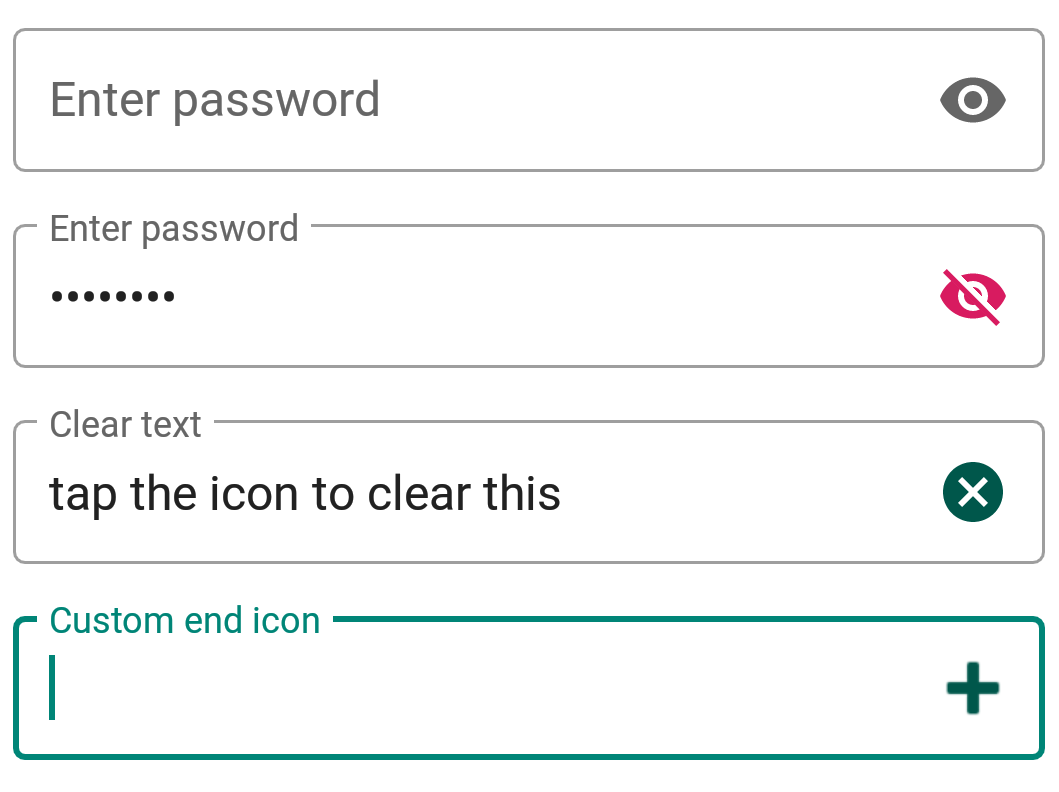
カスタムアイコンの場合、setEndIconOnClickListenerコールバックを使用してクリックを監視し、操作を行うことができます。
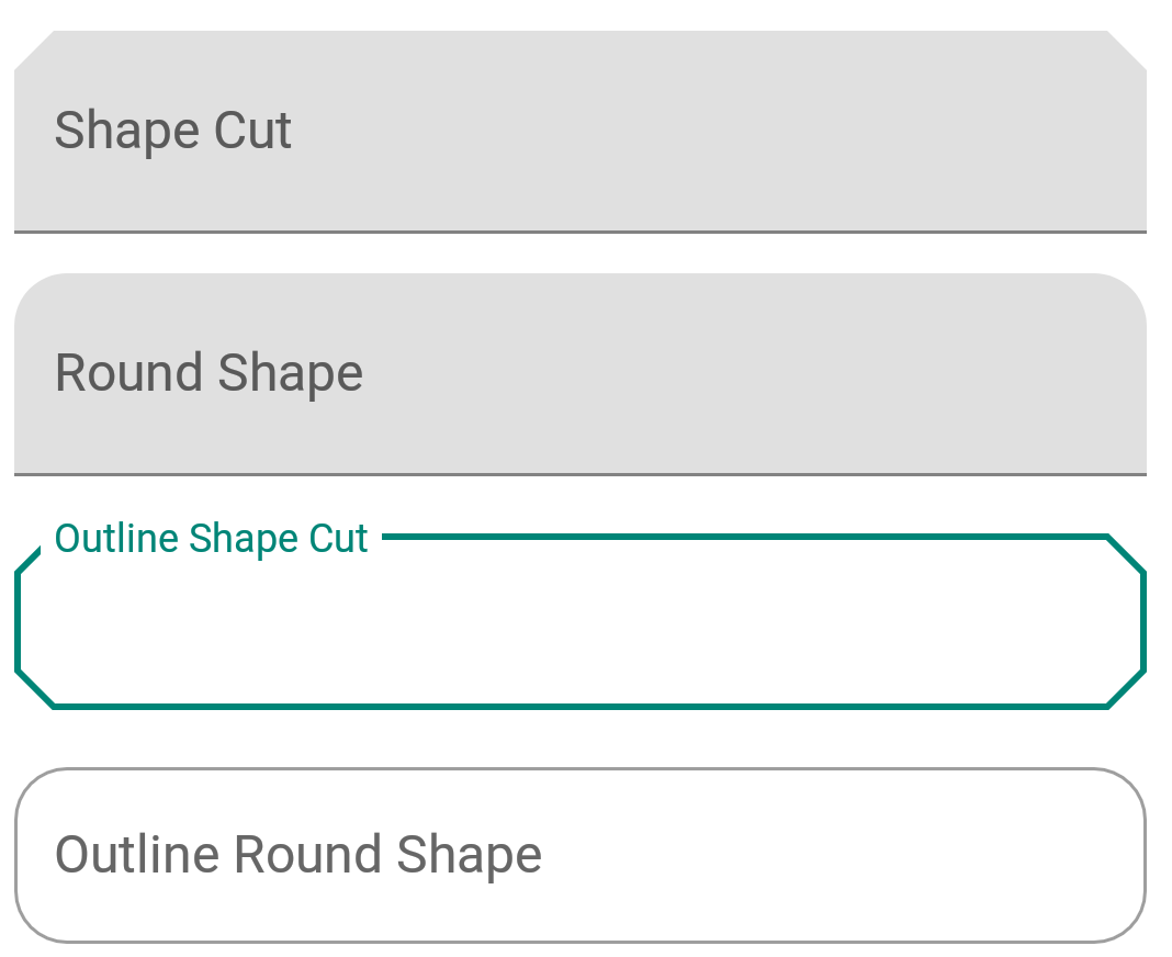
形状がある文字フィールド (Keijō ga aru moji fīrudo)
ShapeAppearanceは強力なスタイルです。テキストフィールドの形状をカスタマイズすることができます。組み込みの形状は2つあります – カットとラウンドです。
<style name="Cut" parent="ShapeAppearance.MaterialComponents.MediumComponent">
        <item name="cornerFamily">cut</item>
        <item name="cornerSize">12dp</item>
    </style>

    <style name="Rounded" parent="ShapeAppearance.MaterialComponents.SmallComponent">
        <item name="cornerFamily">rounded</item>
        <item name="cornerSize">16dp</item>
    </style>
上記のスタイルをshapeAppearance属性に設定すると、これが得られます。
今のところ、それがMaterial Components Text Fieldsの要点です。以下のソースコードには、上記の概念がすべて含まれています。
AndroidMaterialTextFieldsを日本語で自然に言い換えると、以下のようになります:
Androidマテリアルテキストフィールド
以下はGitHubプロジェクトへのリンクです。