Androidのマテリアルコンポーネント – MaterialAlertDialog
Material Design 2.0が登場して、ダイアログを手に入れるのが待ちきれません。このチュートリアルでは、AndroidアプリケーションでMaterial Themeを使用してダイアログをカスタマイズしていきます。
素材コンポーネント – ダイアログ
警告ダイアログはアプリケーションの重要な部分です。通常、ユーザーの注意を重要な事柄に向けるために使用されます。Material Design 2.0のおかげで、より強力なダイアログを利用できます。まず、マテリアルコンポーネントの依存関係を追加する必要があります。
implementation 'com.google.android.material:material:1.1.0-alpha09'
アクティビティのテーマとして、MaterialComponentテーマまたはその派生を継承することを忘れないでください。
基本的な実装
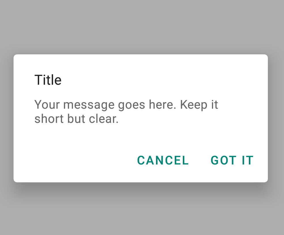
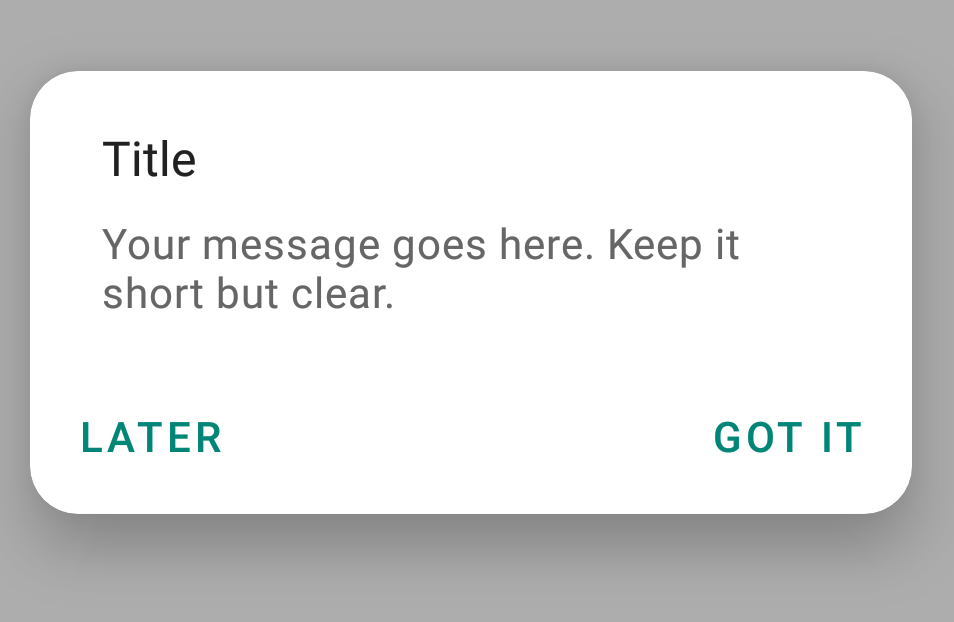
では、ビルダーパターンを使用して基本的なMaterialAlertDialogを作成しましょう。
new MaterialAlertDialogBuilder(MainActivity.this)
                        .setTitle("Title")
                        .setMessage("Your message goes here. Keep it short but clear.")
                        .setPositiveButton("GOT IT", new DialogInterface.OnClickListener() {
                            @Override
                            public void onClick(DialogInterface dialogInterface, int i) {

                            }
                        })
                        .setNegativeButton("CANCEL", new DialogInterface.OnClickListener() {
                            @Override
                            public void onClick(DialogInterface dialogInterface, int i) {

                            }
                        })
                        .show();
画面では、こう見えます。
古いアラートダイアログと比較してみましょう。 (Furui arēto daiarogu to hikaku shite mimashou.)
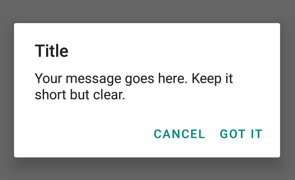
確かに、新しいMaterialAlertDialogはずっと魅力的に見えます。
AlertDialogは構成の変更時にその内容を失います。したがって、AppCompatDialogFragmentを使用することをお勧めします。ただし、このチュートリアルの簡素化のために、私たちはMaterialAlertDialogを使います。
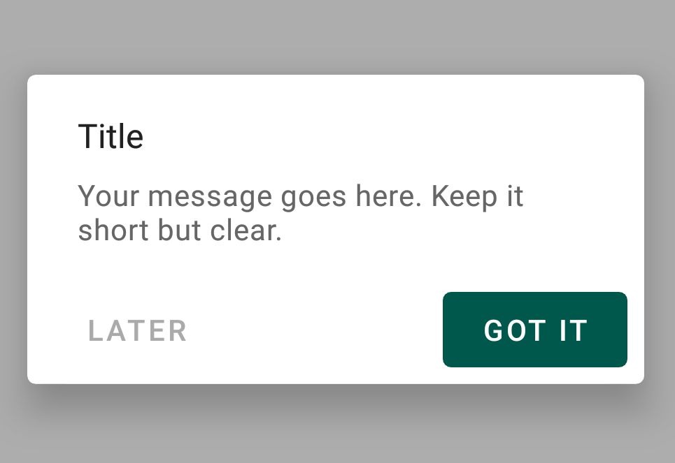
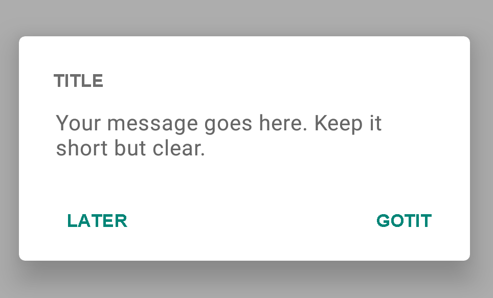
スタイルを付けたボタン
MaterialAlertDialogのボタンは、ただのMaterialButtonsなので、バリエーションを設定することができます。アウトラインボタンやボーダーレスボタン、リップルエフェクトなどを設定してみましょう。例を見てみましょう。
<style name="AlertDialogTheme">
        <item name="buttonBarPositiveButtonStyle">@style/Alert.Button.Positive</item>
        <item name="buttonBarNeutralButtonStyle">@style/Alert.Button.Neutral</item>
    </style>

    <style name="Alert.Button.Positive" parent="Widget.MaterialComponents.Button.TextButton">
        <item name="backgroundTint">@color/colorPrimaryDark</item>
        <item name="rippleColor">@color/colorAccent</item>
        <item name="android:textColor">@android:color/white</item>
        <item name="android:textSize">14sp</item>
        <item name="android:textAllCaps">false</item>
    </style>

    <style name="Alert.Button.Neutral" parent="Widget.MaterialComponents.Button.TextButton">
        <item name="backgroundTint">@android:color/transparent</item>
        <item name="rippleColor">@color/colorAccent</item>
        <item name="android:textColor">@android:color/darker_gray</item>
        <item name="android:textSize">14sp</item>
    </style>
new MaterialAlertDialogBuilder(MainActivity.this, R.style.AlertDialogTheme)
                .setTitle("Title")
                .setMessage("Your message goes here. Keep it short but clear.")
                .setPositiveButton("GOT IT", new DialogInterface.OnClickListener() {
                    @Override
                    public void onClick(DialogInterface dialogInterface, int i) {

                    }
                })
                .setNeutralButton("LATER", new DialogInterface.OnClickListener() {
                    @Override
                    public void onClick(DialogInterface dialogInterface, int i) {

                    }
                })
                .show();
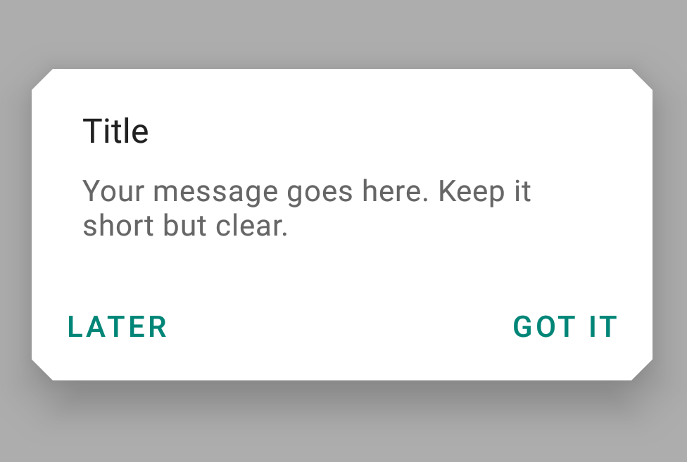
カットされた形状の対話
Material Dialogsで形状を設定することができます!ShapeAppearanceスタイルを継承して、カットされた形状のスタイルを作成しましょう。
<style name="CutShapeTheme" parent="ThemeOverlay.MaterialComponents.Dialog.Alert">
        <item name="shapeAppearanceMediumComponent">@style/CutShapeAppearance</item>
    </style>

    <style name="CutShapeAppearance" parent="ShapeAppearance.MaterialComponents.MediumComponent">

        <item name="cornerFamily">cut</item>
        <item name="cornerSize">10dp</item>
    </style>
今は、ビルダーコンストラクタでスタイルを設定するだけです。
new MaterialAlertDialogBuilder(MainActivity.this, R.style.CutShapeTheme)
                .setTitle("Title")
                .setMessage("Your message goes here. Keep it short but clear.")
                .setPositiveButton("GOT IT", new DialogInterface.OnClickListener() {
                    @Override
                    public void onClick(DialogInterface dialogInterface, int i) {

                    }
                })
                .setNeutralButton("LATER", new DialogInterface.OnClickListener() {
                    @Override
                    public void onClick(DialogInterface dialogInterface, int i) {

                    }
                })
                .show();
丸い形の対話
<style name="RoundShapeTheme" parent="ThemeOverlay.MaterialComponents.Dialog.Alert">
        <item name="shapeAppearanceMediumComponent">@style/RoundShapeAppearance</item>
    </style>

    <style name="RoundShapeAppearance" parent="ShapeAppearance.MaterialComponents.MediumComponent">

        <item name="cornerFamily">rounded</item>
        <item name="cornerSize">16dp</item>
    </style>
前のコードスニペットからDialog Builderのコンストラクタに上記のスタイルを設定すると、次のようになります。
これらのデザイン、本当にたまらなく魅力的でしょう!
カスタムフォントダイアログ
最後に、以下に示すようにボタンとタイトルにカスタムのフォントファミリーを設定することもできます。
<style name="CustomFont" parent="ThemeOverlay.MaterialComponents.Dialog.Alert">
        <item name="fontFamily">@font/amatic</item>
        <item name="android:textAllCaps">false</item>
    </style>
以下に示す通り、これにより私たちはまったく新しい外観のダイアログを得ます。
これでチュートリアルは終了です。上記に使用されているフォントは、以下に添付されたソースコードで利用可能です。
アンドロイドマテリアルコンポーネントのダイアログ
GitHubプロジェクトのリンク